
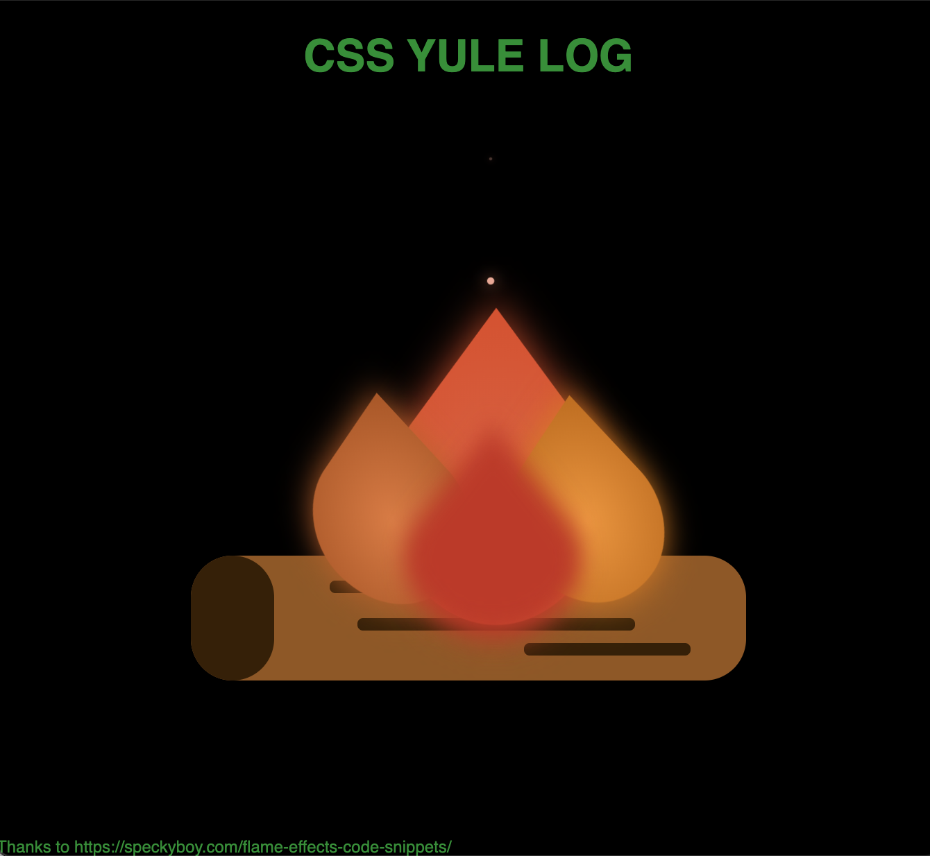
Gatsby threw down a silly site challenge the other day. I figure I don’t know enough about CSS, so building something in Pure CSS will be a great learning experience. My goal is to create a burning Yule Log. Thanks to https://speckyboy.com/flame-effects-code-snippets/, I found a great example.
My final example is here https://gatsby-css-yule-log.netlify.app/
npm init gatsby
npm install node-sass gatsby-plugin-sass
npm install gatsby-plugin-react-helmet react-helmet
Now configure gatsby
gatsby-config.js
module.exports = {
    plugins: [`gatsby-plugin-react-helmet`, `gatsby-plugin-sass`],
}
Update index.js
src/pages/index.js
import * as React from 'react'
import Helmet from 'react-helmet'
import '../styles/index.scss'

const IndexPage = () => {
    return ( <
        >
        <
        Helmet title = 'css yule log'
        defer = {
            false
        } >
        <
        meta name = 'description'
        content = 'Gatsby silly site entry - CSS yule log' /
        >
        <
        meta charSet = 'utf-8' / >
        <
        html lang = 'en' / >
        <
        /Helmet> <
        header >
        <
        h1 > css yule log < /h1> < /
        header > <
        main >
        <
        div className = 'log' >
        <
        div className = 'bark bark1' / >
        <
        div className = 'bark bark2' / >
        <
        div className = 'bark bark3' / >
        <
        /div> <
        div class = 'fire' >
        <
        div class = 'flame-main' >
        <
        div class = 'flame' > < /div> <
        div class = 'ember emberAnimation' > < /div> < /
        div > <
        div class = 'flame-left ' >
        <
        div class = 'flame' > < /div> < /
        div > <
        div class = 'flame-right ' >
        <
        div class = 'flame' > < /div> < /
        div > <
        div class = 'flame-base ' >
        <
        div class = 'flame' > < /div> <
        div class = 'ember emberAnimation' > < /div> <
        div class = 'ember emberSlowAnimation' > < /div> < /
        div > <
        /div> < /
        main > <
        footer >
        Thanks to https: //speckyboy.com/flame-effects-code-snippets/
        <
        /footer> < / >
    )
}

export default IndexPage
Create an empty file for our styles
src/styles/lindex.scss
run it
gatsby develop.log {
background-color: $logColor;
width: 400px;
height: 90px;
border-radius: 30px;
position: absolute;
top: $logTop;
left: 50%;
transform: translate(-50%, 0%);
.bark {
background-color: $barkColor;
border-radius: 10px;
position: absolute;
}
.bark1 {
width: 30%;
height: 10%;
top: 20%;
left: 25%;
}
.bark2 {
width: 50%;
height: 10%;
top: 50%;
left: 30%;
}
.bark3 {
width: 30%;
height: 10%;
bottom: 20%;
right: 10%;
}
}
.log:after {
background-color: $barkColor;
width: 60px;
height: 100%;
border-radius: 30px;
position: absolute;
content: '';
}The basic shape of the log is just a rectangular div with a border-radius. We then add some bark using the same technique. We finish it up with an :after pseudo-element for the end of the log. I use SASS variables for some of the colors and positioning.
$logColor: rgb(143, 88, 33);
$barkColor: rgb(53, 32, 6);
$logTop: 400px;
$baseFlameSize: 150px;
$emberColor: #da633e;
$flameMainColor: #da633e;
$flameLeftColor: #da7c3e;
$flameRightColor: #ec9634;
$flameBaseColor: #db4a30;
$embeSize: 10px;The flames are all similar so let’s only look at the main Flame for now. We draw the Flame using border-radius on three corners to get a teardrop shape and then rotate it 45 degrees to stand it up.
.flame {
  position: absolute;
  width: 100%;
  height: 100%;
  transform: scaleX(0.8) rotate(45deg);
  border-radius: 0 40% 60% 40%;
}
Now for each Flame, we add some styles to may it unique.
.flame-main {
  position: absolute;
  height: 120%;
  width: 120%;
  bottom: 0%;
  left: -20px;
  animation: flameUpDown 3s ease-out;
  animation-iteration-count: infinite;
  animation-fill-mode: both;
  .flame {
    background-image: radial-gradient(
      $flameMainColor 0%,
      darken($flameMainColor, 5%) 95%
    );
    filter: drop-shadow(0 0 15px darken($flameMainColor, 10%));
  }
}
In the first section, we are sizing and positioning. Then we add some animations and background color. The animation uses keyframes.
@keyframes flameUpDown {
  0%,
  100% {
    transform: scaleY(1) scaleX(1);
  }
  50%,
  90% {
    transform: scaleY(1.1);
  }
  75% {
    transform: scaleY(0.95);
  }
  80% {
    transform: scaleX(0.95);
  }
}
We are just playing with the scaling in this example. Keyframes let us set scaling at specific points in the animation. When we run the animation, the browser interpolates the transitions.
This Flame uses a background-image with a gradient to give it a 3D feel along with a drop shadow.
The other Flames are slight variations on the theme.
#Draw Embers The embers or sparks are more of the same. We draw them as rectangles with a border-radius. This time we use background-color, which will be animated. We also add a drop shadow for polish.
.ember {
  position: absolute;
  top: 0%;
  left: 45%;
  width: $embeSize;
  height: $embeSize;
  background-color: lighten($emberColor, 20%);
  border-radius: 50%;
  filter: drop-shadow(0 0 10px lighten($emberColor, 10%));
}
The animation gets its own class, allowing us to swap out animations easily. I want a flame to produce multiple embers. There are a couple of ways to do this, but I opted to use two animations offset in time.
There you have it, a useless and silly site.
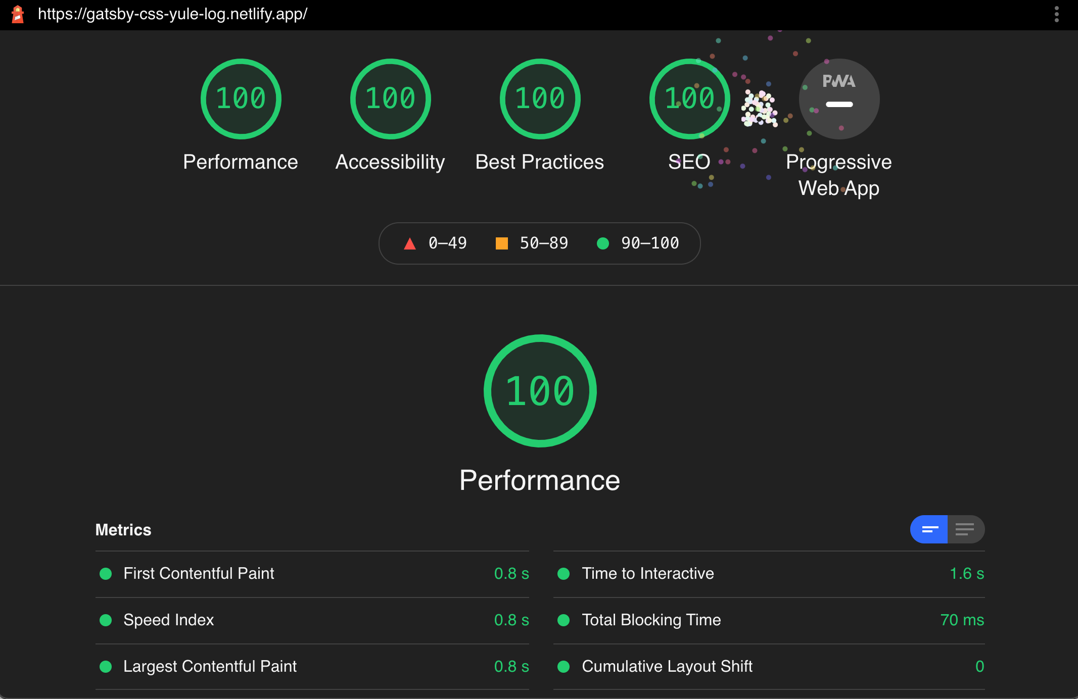
Check out the Lighthouse score.
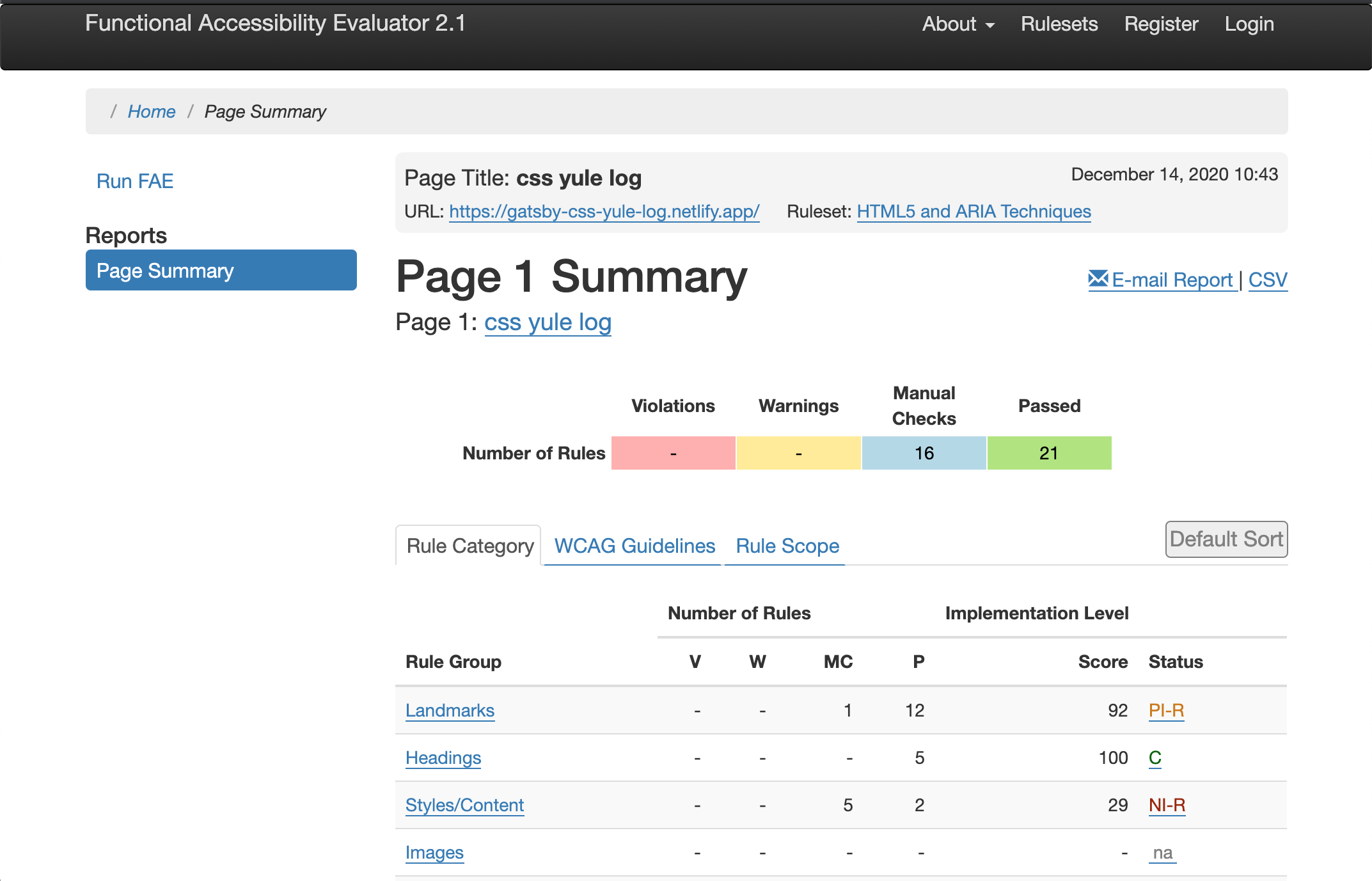
It has great accessibility too.
 My Digital Garden